
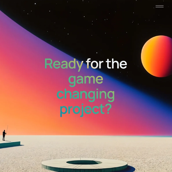
Veritas
Quiet luxury on the web — without the museum coldness
/ Overview
Veritas is a concept study — a self-initiated brief for an heirloom watch label whose buyer expects gravitas and tactility from every surface. We treated it as a real product: type and color decisions, photography direction notes, and a working front-end with real editorial pacing.
/ What each case study includes
Brief: The product idea and audience we set out to serve
Process: How we moved from sketch to system
Decisions: Type, color, grid & motion choices, and why
Build: Stack, performance posture, and what we'd ship
Status: Concept / spec work — not a shipped product
/ Challenge
Most luxury watch sites pick one of two failure modes: museum-cold (you can't tell what to buy) or storefront-cheap (everything feels mass-market). Veritas needed the gravitas of a heritage label with the interaction quality of a modern product page — both at once.
/ Provided Services
Brand identity
Wordmark, type system, and motion language built around the discipline of horology — restraint as the brand's primary tool.
Editorial direction
Per-product narratives, photography direction notes, and the rhythm between product and story across the site.
E-commerce design
Detail, configurator, and checkout designed so the buying flow doesn't break the editorial frame.
/ Solution
Editorial pacing throughout. Hero typography sets tone, then content reveals slowly as the visitor scrolls. Watch detail pages treat each timepiece as the subject of a magazine feature — provenance, movement, and craftsmanship surfaced as ambient editorial rather than spec sheets.
/ Tech stack
Next.js + Headless commerce
Server-rendered product pages for performance and editorial fidelity; previewable drafts so the brand team can compose without waiting on engineering.
GSAP + ScrollTrigger
Slow reveals, type-led transitions, and the parallax behavior that gives the product the right tempo.
Lenis
Smooth scrolling that lets the editorial pacing land — feel matters more on this brand than on most.