


Railroad.ai
A SaaS landing page that practices what the product preaches
/ Overview
Railroad.ai is a concept study — a self-initiated brief for an AI-assisted focus app whose promise is calm, removing distractions instead of adding them. We designed the landing page as if a real product team would ship it: hero, walkthrough, pricing, FAQ — and a working front-end posture for it.
/ What each case study includes
Brief: The product idea and audience we set out to serve
Process: How we moved from sketch to system
Decisions: Type, color, grid & motion choices, and why
Build: Stack, performance posture, and what we'd ship
Status: Concept / spec work — not a shipped product
/ Challenge
Most SaaS landings drown in feature lists, social-proof logos, and competing CTAs. Railroad.ai is an app about removing distractions — so the landing page had to demonstrate that discipline before the visitor even reads the headline.
/ Provided Services
Brand positioning
Headline, voice, and the visual restraint that lets the message land — the brand earns its calm.
Landing page design
Hero, feature walkthrough, pricing, and FAQ designed as a single reading sequence rather than a stack of marketing blocks.
UI/UX for product surfaces
Selected in-product screens used on the landing so the visual continuity between marketing and product is real, not painted-on.
/ Solution
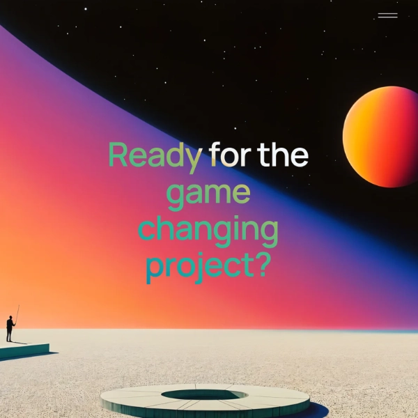
One screen, one idea at a time. The headline does the heavy lifting; secondary copy stays minimal. A single primary CTA per section. The page reads more like a product walkthrough than a marketing site — which is the proof point the product itself promises.
/ Tech stack
Next.js (App Router)
SSG for the marketing page; partial hydration so interactive bits don't weigh down the main thread.
Tailwind + Framer Motion
Tight design system with motion reserved for transitions that earn their place — never decoration.
Vercel Analytics + Edge
Light analytics and edge rendering so the page stays fast in every market — performance is part of the brand promise.